COURTNEY CALABRESE
Courtney is a Visual Artist working between New York City and New Jersey. Working in large-scale format oil paintings as well as graphic design.
She is currently a Graphic Designer working creating fragrance packaging for companies such as Juicy Couture, Aeropostale, Joseph Abboud, Nautica, Perry Ellis, English Laundry, and more.
Contact information:
courtneycalabrese1@gmail.com
ACHIEVEMENTS IN THE ARTS
Lead Graphic Designer → 3B International, Totowa, NJ, 2022-Present
Art Consultant → Eden Fine Art Gallery, NYC, 2021–2022
BFA in Visual Arts, Painting → Montclair State University, 2021
Awarded Best In Visual Arts: Painting→ Montclair State Staff, 2021
EXHIBITIONS
2021 Shine Group Exhibition curated by Fable Jones Studio, Brooklyn, NY
2021 Bushwick Open Studios curated by Fable Jones Studio, Brooklyn, NY
2021 The Bodega #fortheculture Gallery Pop Up curated by The Culture Candy, Brooklyn, NY
What do I do?
Working in my current role as a lead graphic designer for a licensing company, I am responsible for working directly with our clients to fulfill their product expectations as well as their customer-facing imagery used on websites such as Macy's, Amazon, etc.
My clients range from Juicy Couture, Aeropostale, English Laundry, Joseph Abboud, Nannette Lepore, and more. Working with Prestige brands which all have highly different stylist aesthetics I am able to adjust my designs to fill the company's direct needs.
Beginning with a seasonal concept, I lead with either harsh direction of the product end goal or conceptualize ideas from scratch.
Targets for me include-
-Create Fresh and Trending Package Design (Font, Illustration, Dieline)
-Choosing a name and fragrance notes for the scent
-Conceptualizing series for the design
-Create content for the marketing team and sales team
-Create Lifestyle Imagery for Clients' websites
-Create Presentations to communicate to clients the internal & external means being met for marketing & costumers
-Formatting content to different domain sizing for Clients
Make your point stand out.
WORDS ONLY SPEAK, VISUALS EXPLAIN
SHOW WHAT YOU MEAN
SHOW WHAT YOU MEAN
SHOW WHAT YOU MEAN SHOW WHAT YOU MEAN
My goal is to help bring the concepts or claims of a product or conversation into a visual explanation. One that is persuasive as well as appealing.
Examples of this are presentations where the graphic is seen in a real-life setting allowing for the client to envision my designs in reality, not just Adobe Suite.
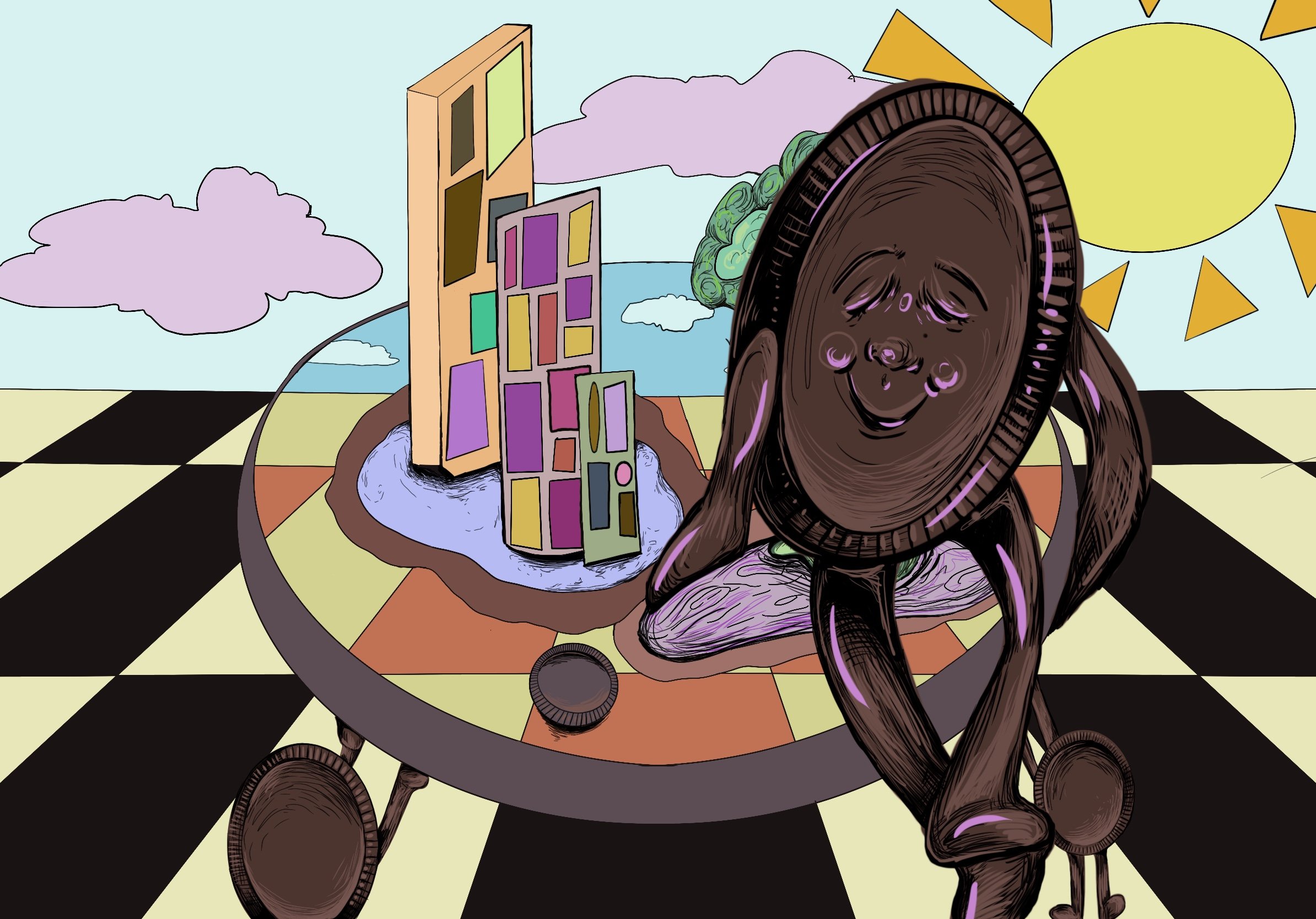
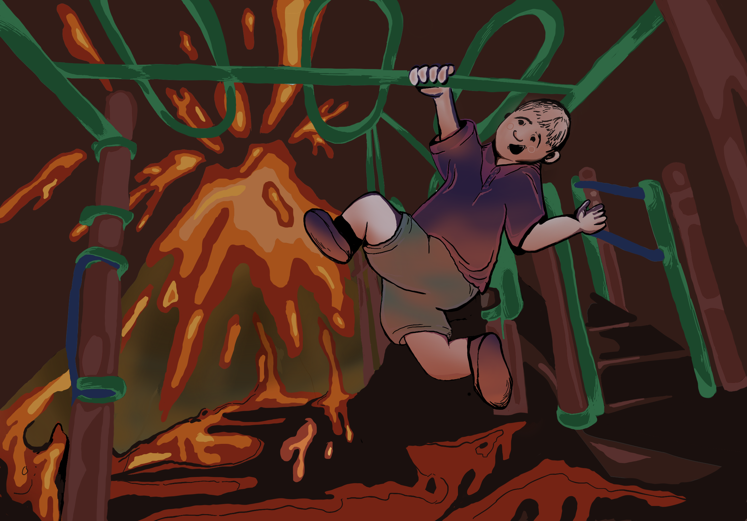
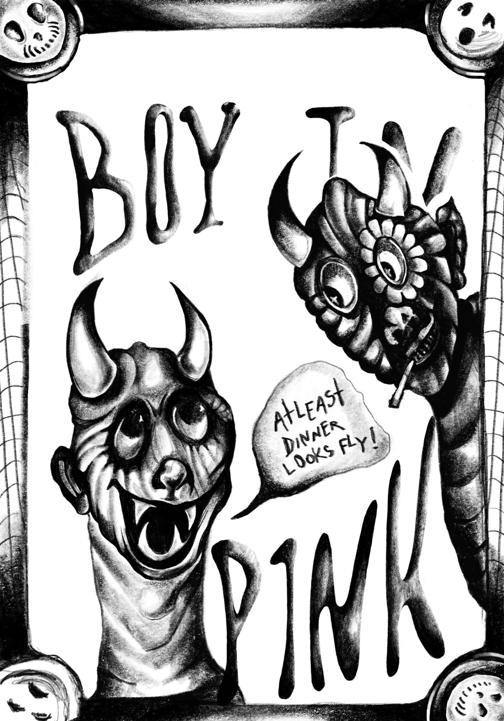
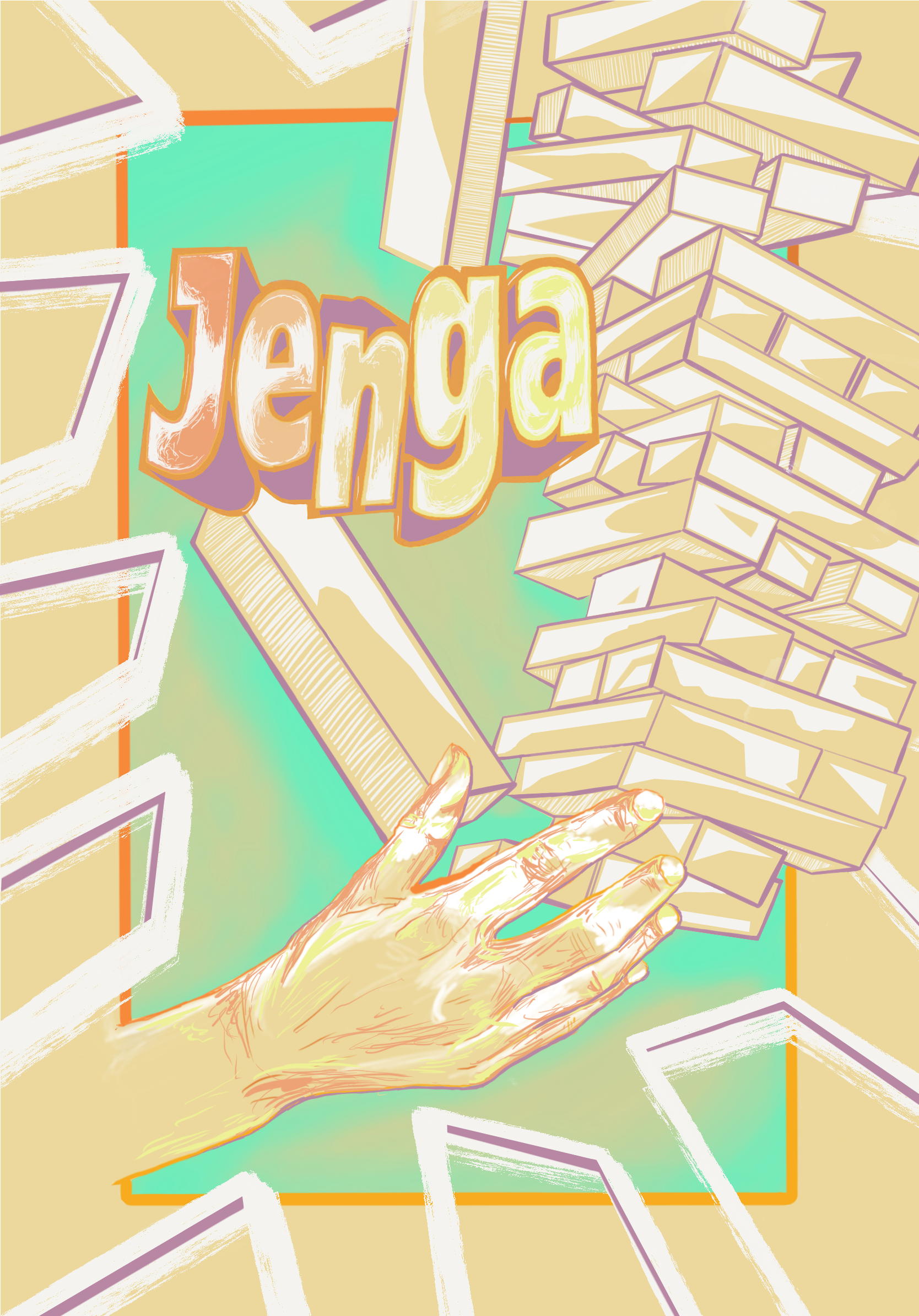
Presentation style examples
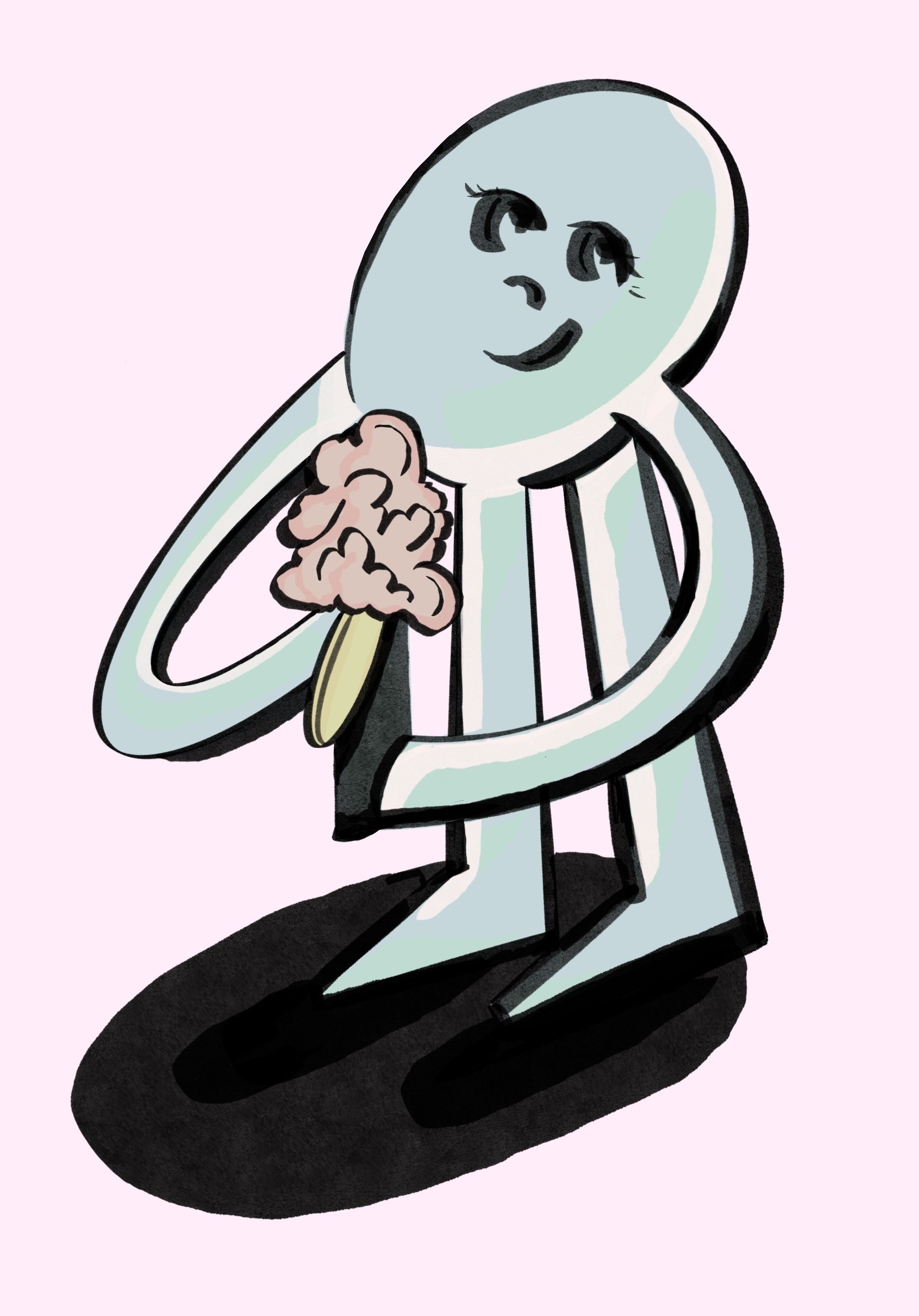
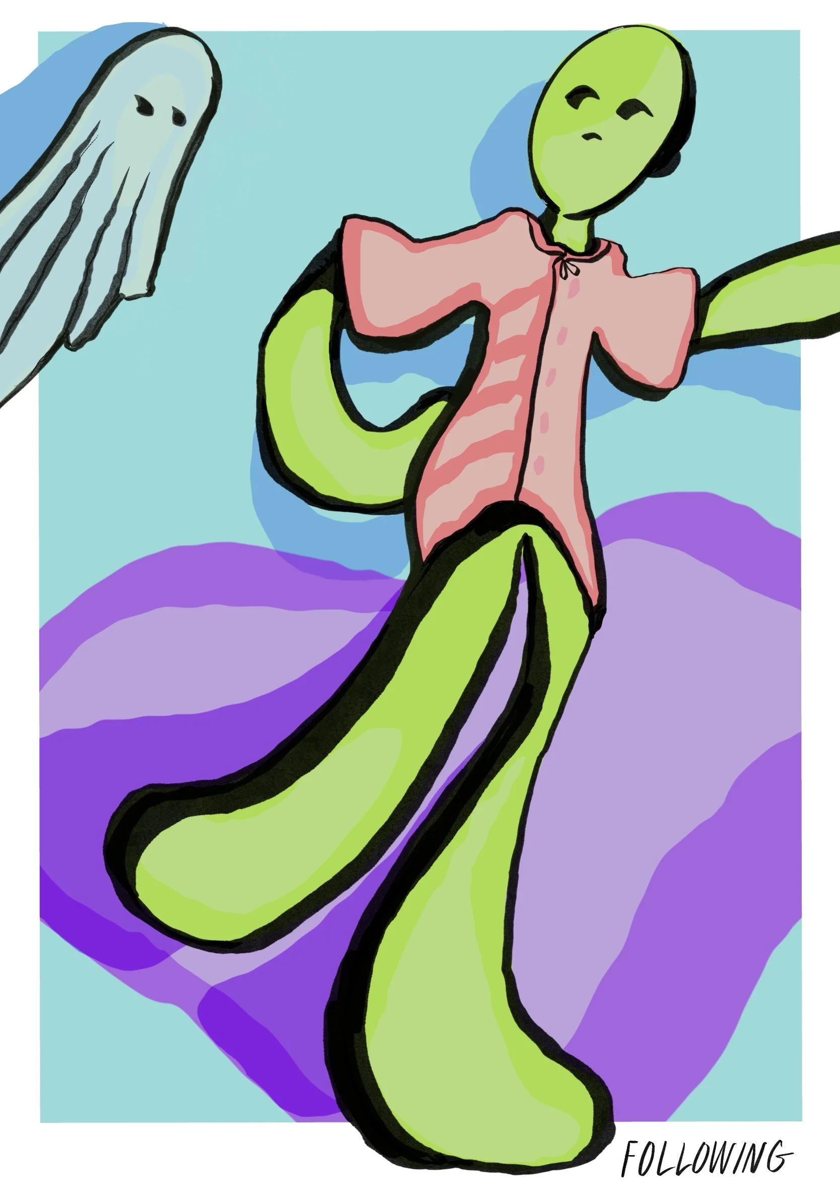
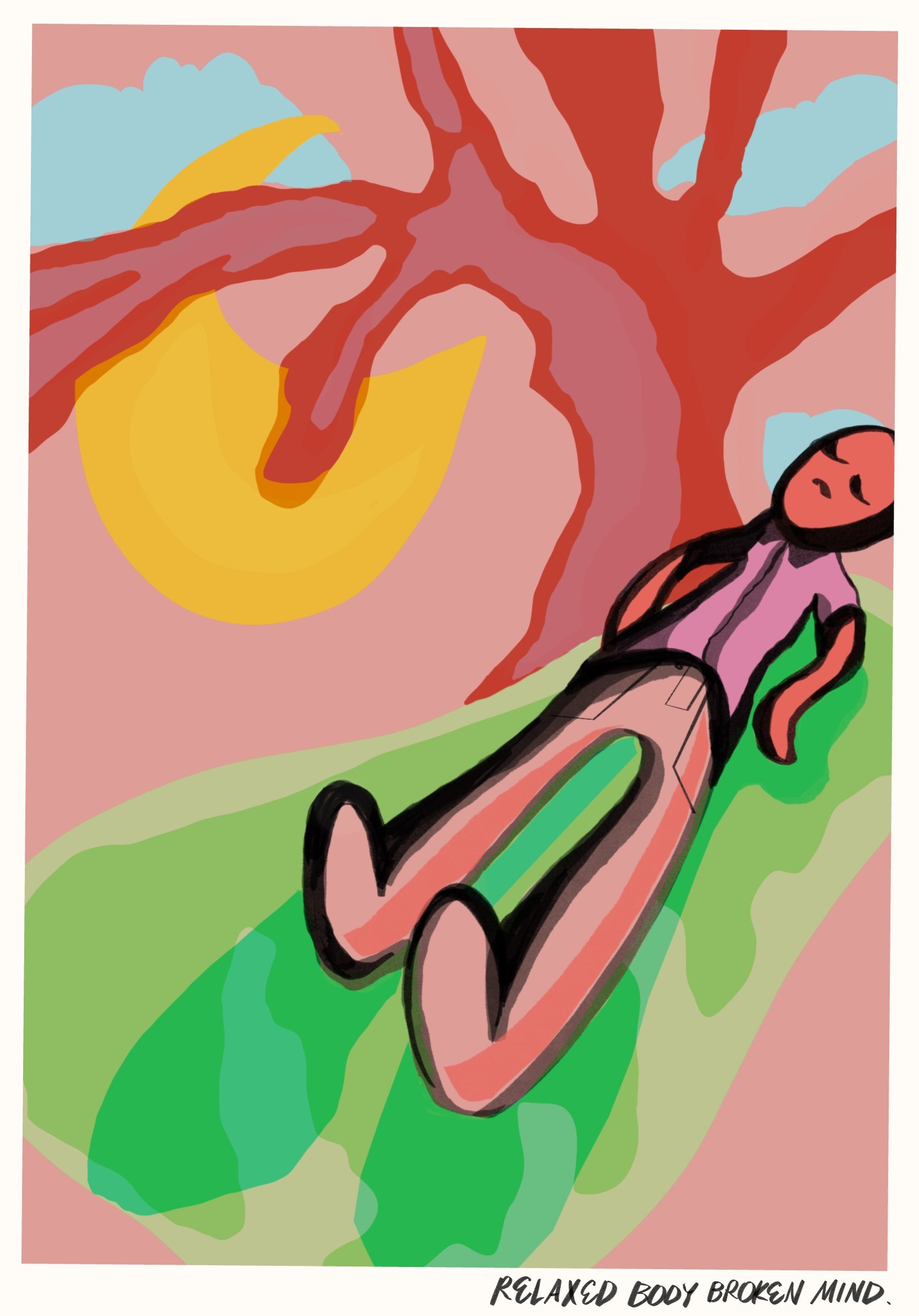
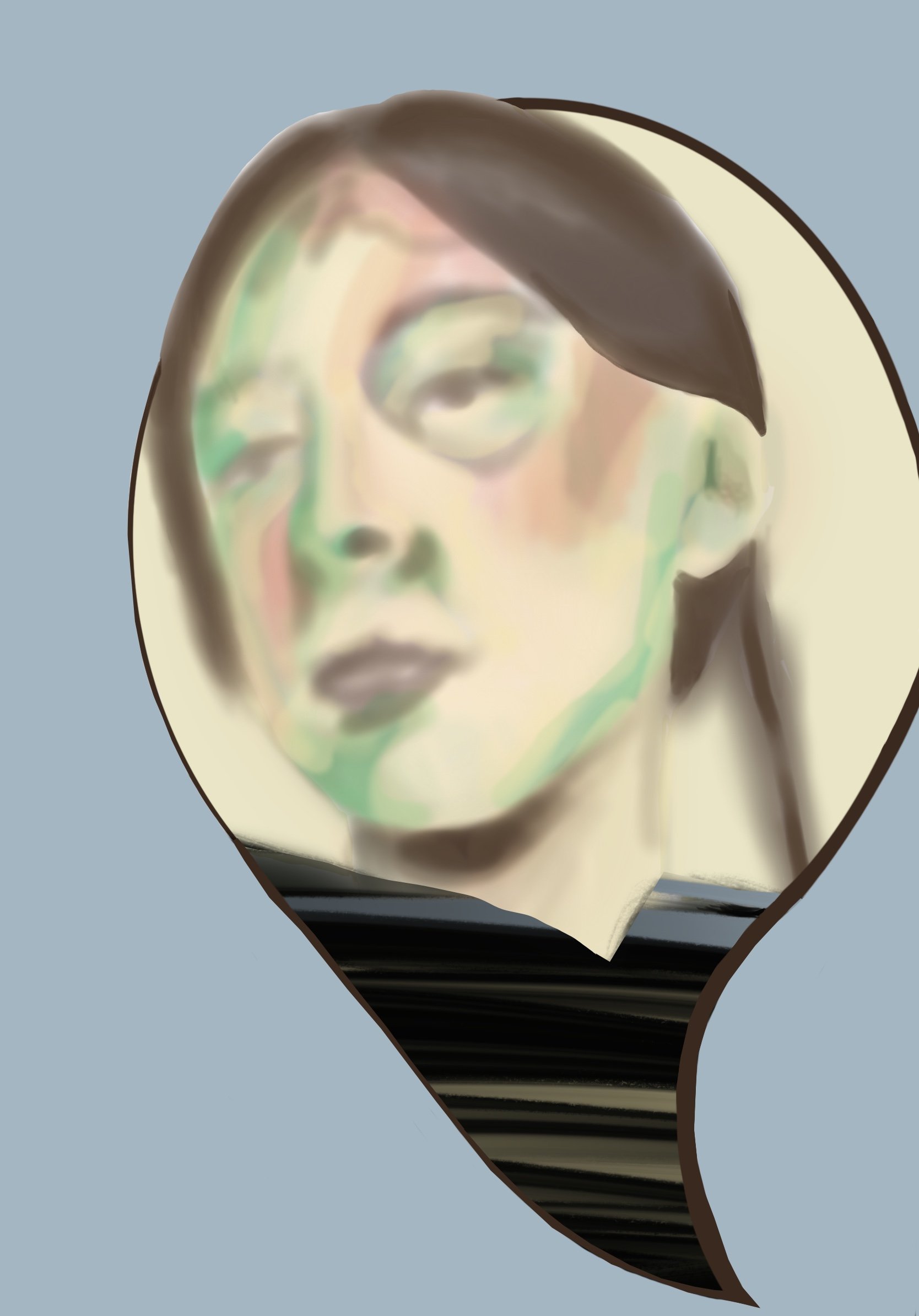
An artist who has turned her skills into assets for others by creating captivating materials to pursue brand politics.









COURTNEY CALABRESE
A PERSONALITY THAT CANNOT BE HELD BACK. A MIND THAT LACKS LINEAR CONCLUSIONS BUT SWIRLS OF IMAGINATION.
Throughout her life, Courtney has been labeled the artist in every community.
Awards and testimonials were not enough. Upon the conclusion of her degree in Fine Arts Painting, she leaped directly into careers that fill her creativity.
Currently working with notable companies such as Juicy Couture, Nautica, Aeropostale, Joseph Abboud, English Laundry, and more. Working closely with brand houses to deliver style-specific graphics for their brand.
The spirit of being alive lives within all of us, though the desire to represent spirits does not.
Overachieving client’s goals for
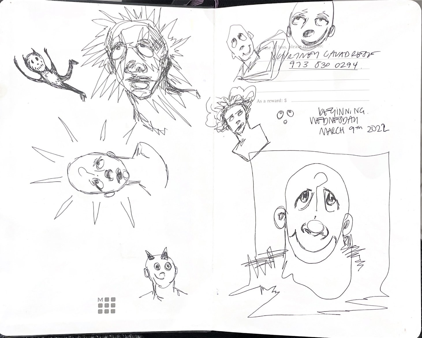
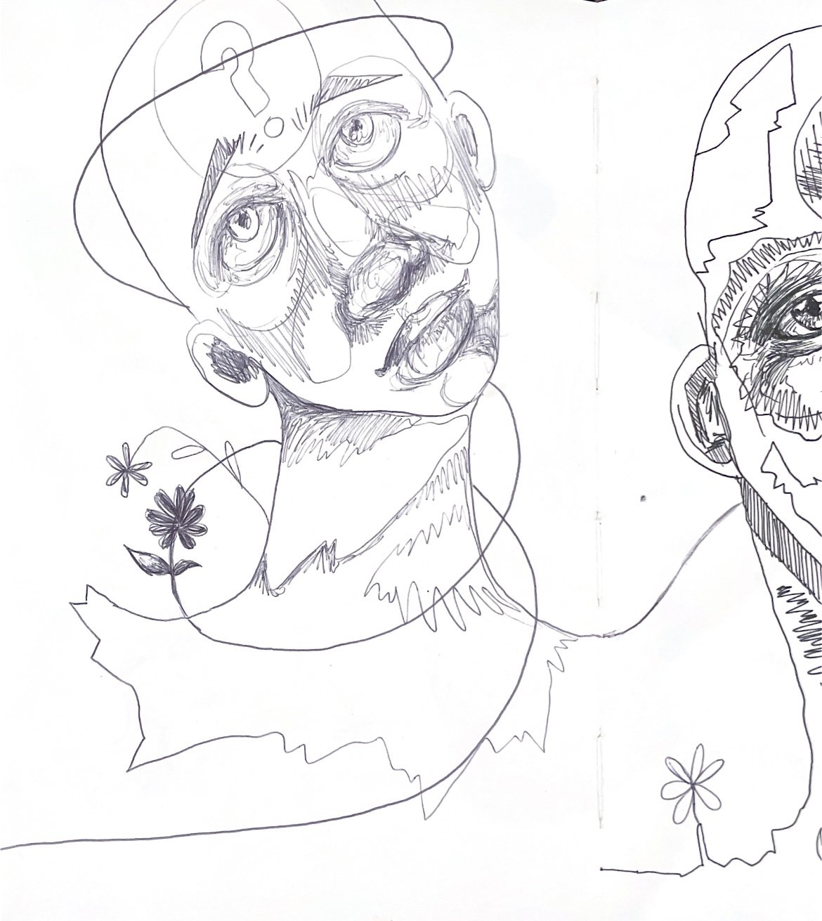
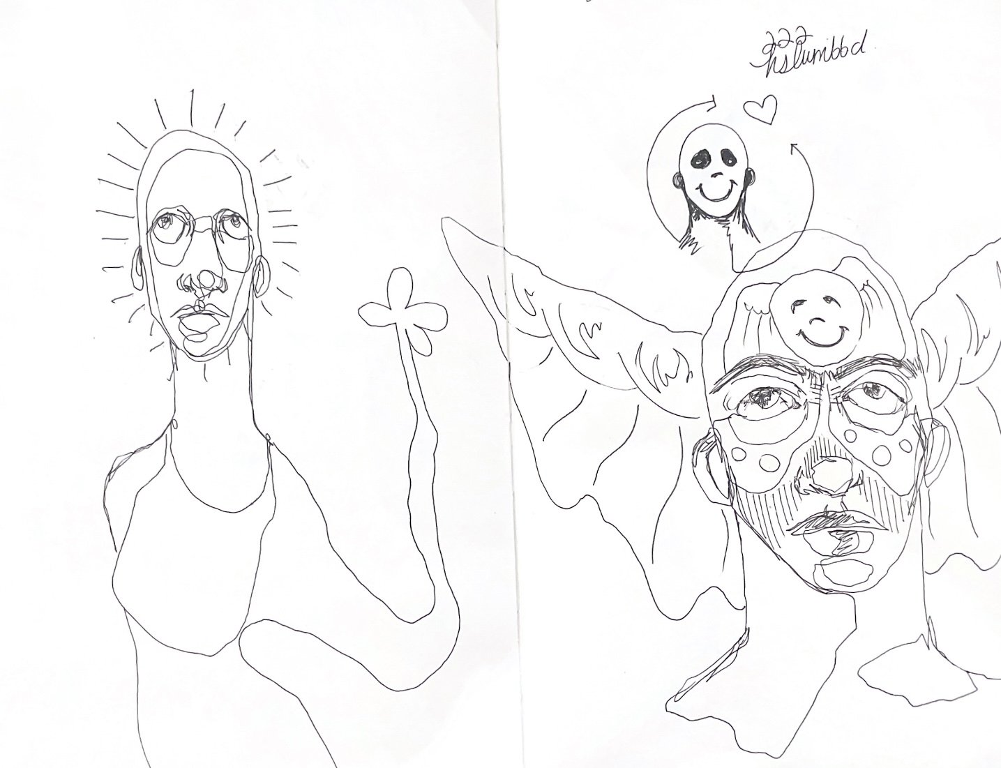
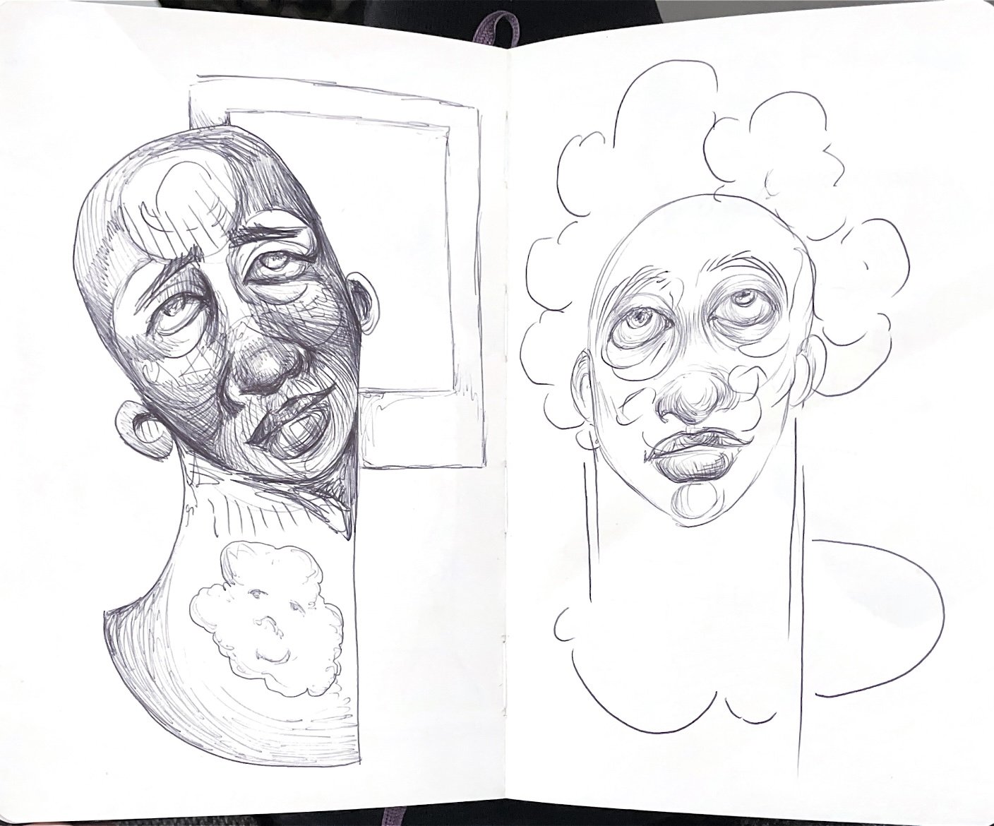
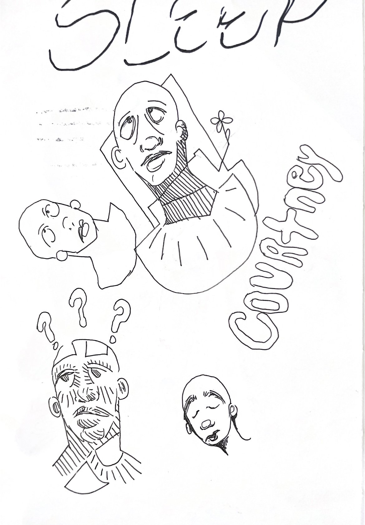
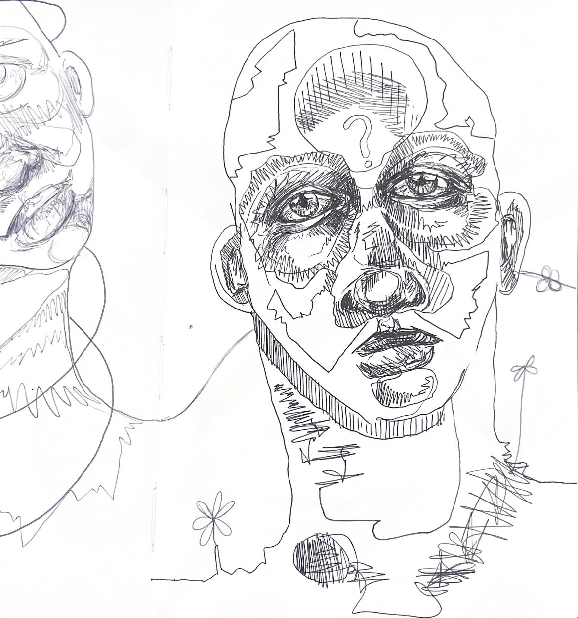
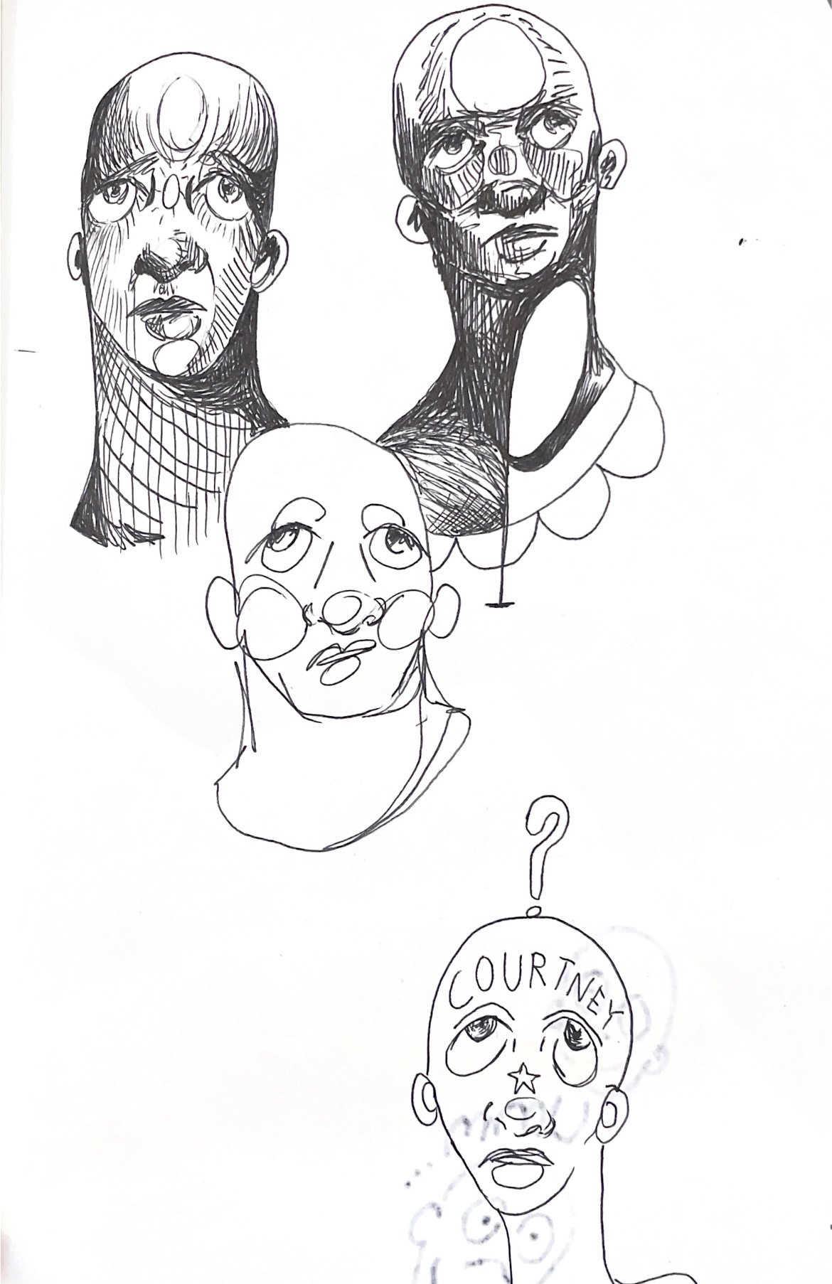
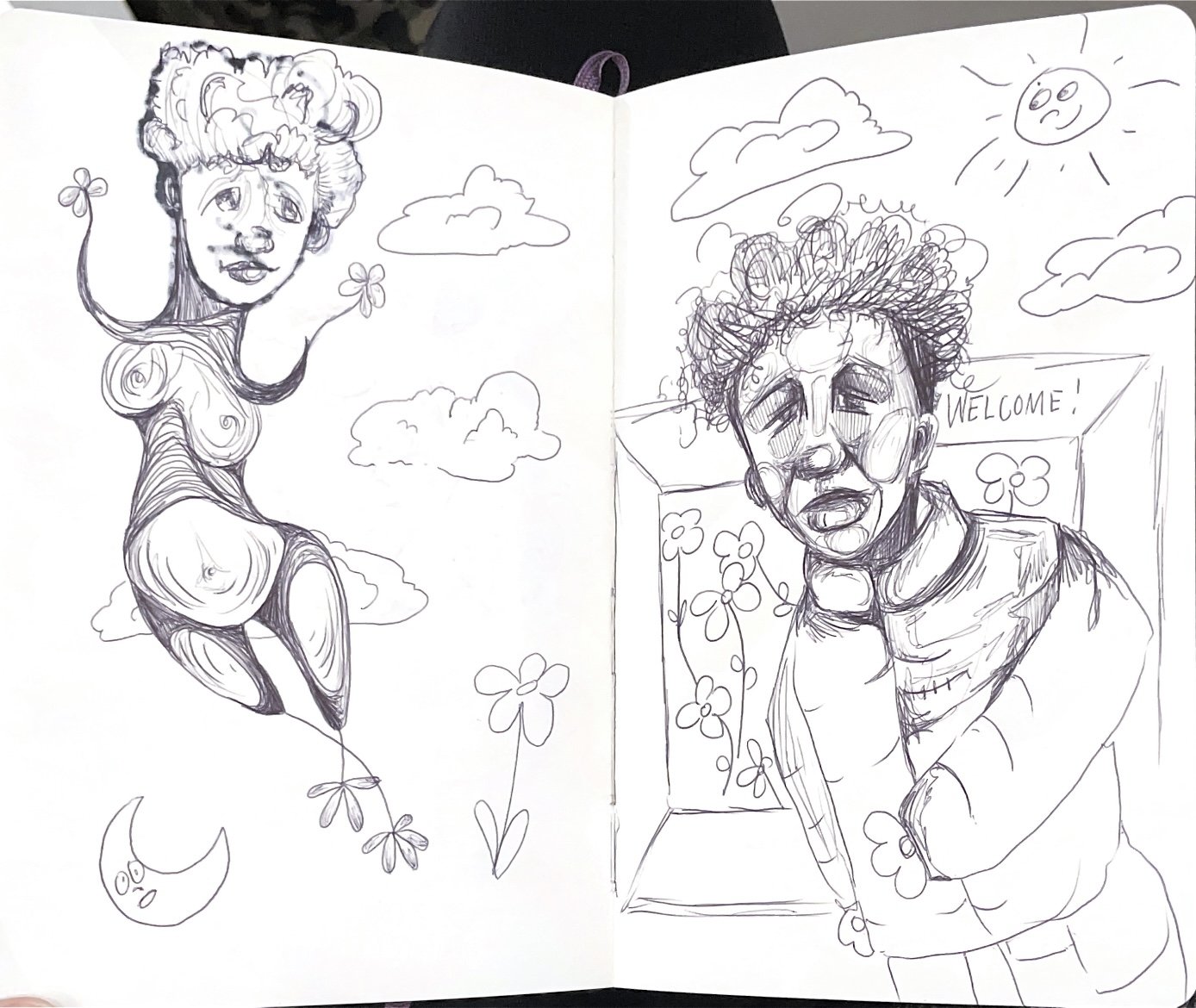
OIL PAINTINGS
-

Absent
36x48in. 2021. Oil and Acrylic on Canvas.
Absent explodes the emotions out feeling dissociated. While the world orbits in circles of chaotic backtrack, pushing forward seems difficult.
-

Breathing Out
36x48in. Oil on Canvas.
Breathing Out, A piece about the release that occurs when one is free to live by their own decisions without regard to outside perspectives. While some past reflections hold onto the new mindset, peace is found when one is alone.
-

Hovering Needles
36x48in. 2021. Oil and Pastel on Canvas.
Hovering Needles expresses the fleeting answer of our existence, that life is as fragile as a latex balloon. If poked, squeezed, or left alone for too long the balloon naturally deteriorates. In this intimate moment, we see the matter of life is to embrace and understand how simple it could be if we allowed our lives to be surviving not production.
-

Patriotically Poisoned
48x68in. 2021. Oil and Acrylic on Canvas.
Patriotically Poisoned is a piece expressing the extreme backtracking necessary in order to be free. With the idea of peace and equality, the power fleets in the eyes of the beholder.
-

Water Me
36x48in. 2021. Oil and Pastel on Canvas.
Water Me depicts a flower figure holding out a flower in a remorseful state. The paradox is meant to display the nature of humans to use other humans for their own needs. As weird as a flower holding a flower seems, we as humans use humans at our own disposal every day. The title calls the need for another to fulfill their survival as we see in many relationships or even in government systems. If we channel back to the oddness using others is, we realize a flower shouldn't be gifting a flower.
-

Grasped Growth
46x68in. 2020. Oil and Pastel on Canvas.
Grasped Growth expresses the power one can gain from believing in time to heal. With the idea of traveling down a road, one will see changes over time that seem as permanent as a burn. Remind oneself change is what allows growth.
-

Influence
36x48in. 2021. Oil on Canvas.
Influence is a piece discussing the false allusions that prevail when one is influenced by others, not themselves. If one does not realize who is influencing their own decision-making, one will end up in a world that is not their own.
-

Wheel Barrow Broken
30x40in. 2021. Oil and Pastel on Canvas
Wheel Barrow Broke explains the lack of knowing what is coming. The title speaks to the fact that the man is sleeping in sorrows in a wheelbarrow that is not broken yet, though the dramatic irony of it breaking and him not knowing is what furthers the plot of the unknown.
-
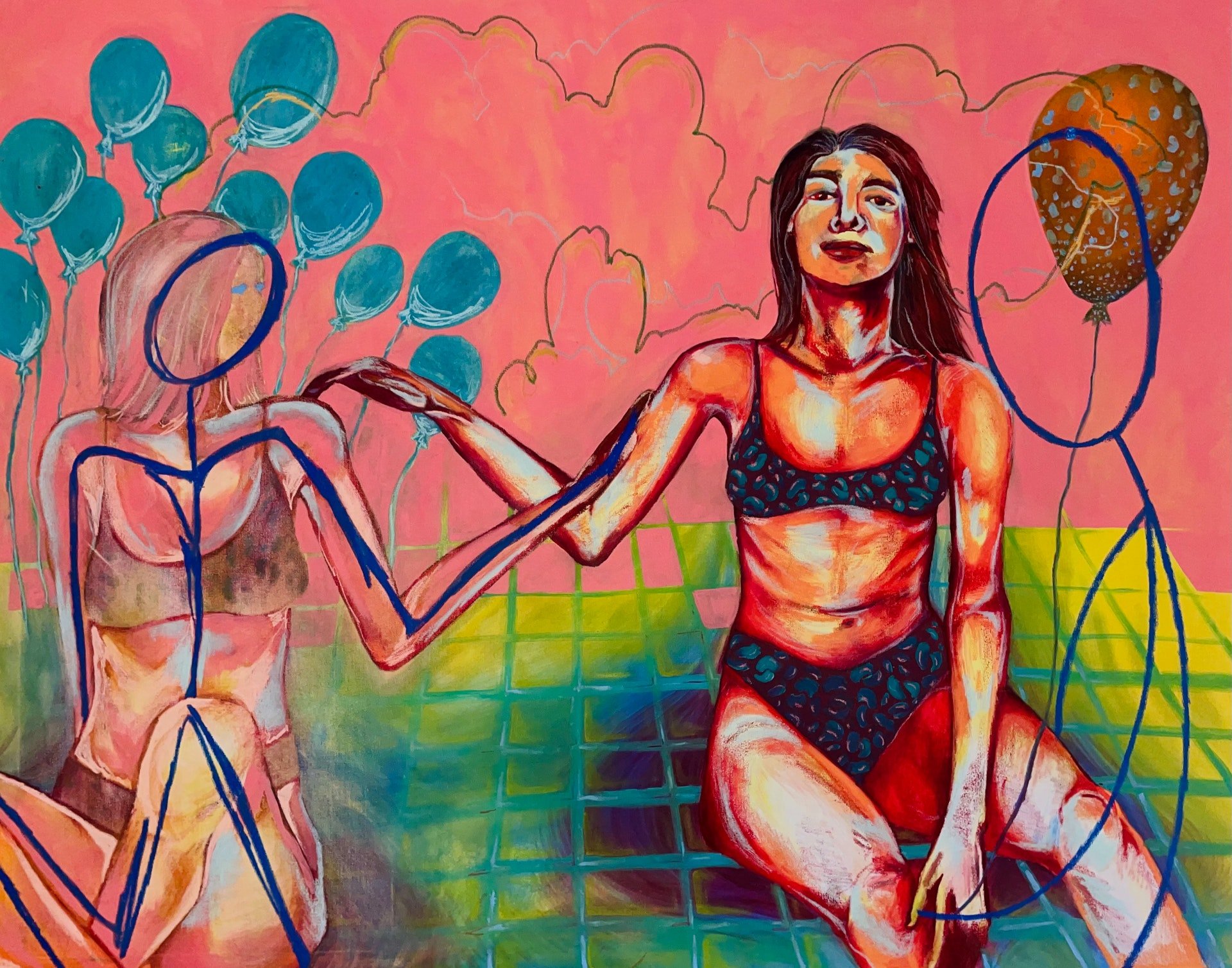
Less Is More
48x68in. 2021. Oil and Pastel on Canvas
Less is More reflects on past times before the pandemic or before isolation, it is easy to see the difference in surroundings. Learning that less stimulation creates more peace of mind, that less is more. The fear of change still hovers over the new ways but the reminder of peace allows change to be beautiful, not harmful.
MIXED MEDIA
-

The Chorus
16x24in. 2021. Charcoal and Marker on Paper.
-

Precaution
36x48in. Acrylic, Charcoal and Colored Pencil on wood.
-

Relief
12x18in. Ink Print on Paper.
-

The Echo
20x30in. Charcoal on toned paper.


